Your Webstore’s Color Settings
Your ecommerce site uses several color settings that help establish your brand identity and improve readability. Here’s what each option controls:
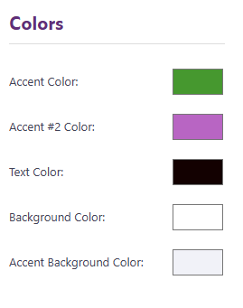
Accent Colors - Accent colors are used in key areas such as the header, footer, buttons, badges, and some headings. These colors usually represent your brand and help important elements stand out.
Choose colors that are consistent with your brand palette and provide good contrast against your background.
Text Color - This color applies to all text across your store—including product descriptions or content pages. For best readability, we recommend using a dark text color on a light background. If your store uses a dark background, choose a light text color instead.
Background Color - This is the primary background color used throughout your store’s pages.
Most ecommerce sites keep this white or very light, as it makes text and product images easier to see and keeps the design clean.
Accent Background Color - This color is used as a background in specific areas, such as the order confirmed page. To keep your layout visually balanced, choose a light or soft shade so it doesn’t overpower the main content.